
Think about the brands you recognize in a split second without even reading their name. Sometimes it is just a familiar symbol stamped onto a product, a specific shade of color flashing on a digital screen, or a unique style of lettering that tells you right away who it belongs to. That right there is the genuine magic of a visual brand identity. It helps a business become deeply memorable before a potential customer ever reads a single line of your marketing pitch.
Stepping back for a moment, designing a logo today is no longer just about picking a cute graphic icon and slapping a company name underneath it. A truly strong logo has to function as one vital piece of a much larger, cohesive visual puzzle. Your core color choices, typography, photography style, website layout, social media graphics, and physical packaging all need to feel like they belong to the exact same family.
Now, this does not mean every business needs a massive, expensive design overhaul or a corporate agency budget. In fact, some of the most unforgettable logos in history are startlingly simple. What really matters is whether the design feels deeply authentic to who you are and whether real people can actually remember it after scrolling past it in a crowded digital feed.
If you are building a fresh brand from scratch, refreshing an older business, or simply trying to figure out how modern visual identity works, the journey starts with one fundamental truth: design should communicate a real message, not just look pretty on a static screen.
What Is a Logo and Visual Brand Identity?
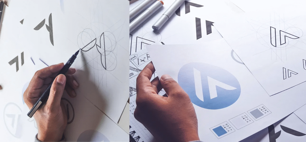
A Logo Is Only One Piece of the Puzzle
A logo is the core visual mark people associate with your business. It might be a standalone symbol, a clean wordmark, a combination of both, or another recognizable visual design.
However, visual brand identity goes much deeper. It includes everything that gives your brand a consistent look and feel across both the physical and digital worlds. This encompasses your logo, color palette, typography, image style, illustrations, icons, packaging, website design, and social media templates.
Think of your logo as the face of the brand. Your visual identity is the clothing, expression, posture, and overall atmosphere that make that face recognizable anywhere. A logo might look stunning all by itself, but if the rest of your brand looks completely different every single time a customer interacts with it, building recognition becomes an uphill battle.
Start by Understanding Your Core Roots
Know What Your Business Actually Stands For
Before you open up a design program or start throwing color swatches around, take a deep breath and step back. Look at the business itself.
What does the company genuinely stand for? Who are you trying to help? What kind of feeling should people have when they step into your digital or physical space?
A cozy children’s bookstore should feel playful, warm, and inviting. A financial advisory firm needs to communicate quiet trust, stability, and professional maturity. A creative freelance studio might lean toward something bold, expressive, and unconventional.
There is no magical universal style that works for every single business. The right visual identity must grow naturally from the internal personality of the brand itself. This is why copying a competitor’s design or chasing whatever style is currently trending online can be dangerous. Trends fade fast, but your brand needs to build lasting recognition over time.
Understand Your Target Audience

Design for the Real People You Want to Reach
A logo isn’t designed just to please the business owner. Your customers are the people who need to recognize it, trust it, and connect with it.
Imagine you are launching a brand tailored for busy remote workers. A visual identity built with a stiff, highly traditional aesthetic might feel completely disconnected from their daily reality. Conversely, a chaotic, neon-heavy design might feel inappropriate for a service that requires calm and reliability.
Take time to genuinely understand the people you want to attract. Think about their lifestyle, what frustrates them, what brings them comfort, and what kind of brands they already trust. The goal is to find that sweet spot between what your business represents and what your audience can naturally resonate with.
Choose a Logo Style That Fits Your Purpose
Keep the Design Meaningful and Clean
There are plenty of different routes you can take in logo design. Some brands rely entirely on clean wordmarks, while others use symbols, monograms, abstract shapes, or a blend of text and imagery.
The best choice depends on what your business actually does. A local bakery might benefit from a warm, approachable wordmark, while a tech platform might need a sharp symbol that works cleanly as a tiny app icon.
Whatever direction you choose, try to avoid packing in extra design elements just because there is empty space on the canvas. Unnecessary shapes, heavy drop shadows, and over-complicated details only make a logo harder to recognize at a glance. A great logo should make sense without needing a lengthy paragraph of explanation.
Simplicity Drives Recognition
One of the most valuable rules in branding is to keep things simple.
Picture how your logo will look on a cramped website header, a tiny smartphone screen, a product label, or a social media profile picture. If a design only looks good when it is blown up to the size of a billboard, it is not practical for everyday business use. Simple designs are inherently easier for the human brain to remember and much easier to print or display across various formats.
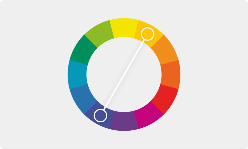
Select Colors With Intention
Colors Trigger Immediate Emotional Responses
Color is usually the very first thing people notice about a visual identity. Different shades carry deep emotional weight—though those feelings can vary depending on context and culture.
Soft blues often communicate calmness and security. Earthy greens connect naturally with growth, health, and fresh outdoor spaces. Warm terracotta and neutral tones create a grounded, understated feeling.
The trick is not to pick a color simply because it is your personal favorite. Ask yourself: does this color support the actual personality of our business? Once you find your main colors, keep the overall palette tight and manageable. Too many random accent colors make a brand feel chaotic and disjointed.
Pick Typography That Speaks Without Words
Fonts Carry Tone of Voice
Typography is often treated as an afterthought, but your choice of font completely alters how a brand feels to an outsider.
A clean, modern sans-serif typeface creates a contemporary, approachable impression. A traditional serif font can feel more established, literary, or sophisticated. A custom script style can feel wonderfully personal, as long as it remains easy to read.
Your fonts need to scale gracefully across different sizes and devices. Using five different fonts on a single page will quickly make your brand look messy. Sticking to one primary typeface and a single supporting style is almost always enough to create variety while maintaining consistency.
Create a Consistent Visual Language
Make Every Touchpoint Feel Connected
A strong visual identity doesn’t end at the bottom of your logo.
Your website should look like it belongs to the exact same universe as your social media channels. Your packaging, email graphics, invoices, and advertisements should all carry the same underlying visual personality.
This doesn’t mean every piece of content has to look identical—repetition shouldn’t feel boring. Instead, use recognizable elements consistently. Your core colors, typography, spacing choices, and graphic shapes create a visual thread that ties your entire business together. Over time, seeing these familiar patterns is what builds genuine brand loyalty.
Think About Digital Branding

Your Logo Must Thrive on Small Screens
Modern businesses live primarily in the digital world. Your logo will show up on responsive website headers, mobile displays, social profile avatars, video thumbnails, and app interfaces.
This means flexibility is non-negotiable. A detailed, intricate badge that looks incredible on a large wooden sign might turn into an unreadable smudge when shrunk down to a 40×40 pixel mobile icon. Consider designing responsive versions of your logo—such as a simplified symbol, a horizontal variation, or a stacked format—so you are always prepared for whatever screen size comes your way.
Make Your Brand Feel Human
Personality Matters More Than Corporate Perfection
People naturally gravitate toward businesses that feel real, honest, and human. Your visual identity can be polished and professional without feeling cold and sterile.
Ask yourself: if our brand walked into a room as a real person, how would they act? Would they be warm and friendly? Quiet and analytical? Bold and adventurous? Curious and creative?
That underlying personality should influence everything from your photography style to your color choices. A brand that wants to feel accessible will avoid stiff, overly corporate imagery, while a luxury brand might lean into generous negative space and restrained color palettes. The ultimate goal is never to fake an identity, but rather to give visual voice to what your business already is at its core.
Avoid Following Every Passing Trend
Build Something Built to Last
Every single year brings a fresh wave of visual design trends. While some are fun to look at, not every trend deserves a permanent home in your brand identity.
If you completely rip up and redesign your visual style every time a new aesthetic goes viral on social media, your customers will constantly wonder who you are. A far better strategy is to build a timeless foundation for your core identity elements, allowing smaller details like campaign graphics and social templates to evolve naturally over time.
Test Your Logo Before Launching It

See How It Handles Real-World Conditions
A design can look flawless on a high-end designer’s monitor and completely fall apart in the real world.
Before you lock in your visual identity, test it out. Place your logo over different background textures, shrink it down on a mobile phone screen, print it out on cheap paper, and see how it looks. Show it to a few trusted people and ask what they notice first. Do they understand what kind of business it represents? Can they sketch it from memory a few minutes later?
Getting honest feedback early on can save you from costly mistakes down the road.
Create Simple Brand Guidelines
Give Your Team a Clear Map
Once your visual identity is fully polished and ready to go, write down a few simple rules for how it should be used.
A straightforward brand guide doesn’t need to be a fifty-page corporate textbook. It just needs to outline your approved logo variations, exact color hex codes, font choices, and basic spacing rules. This becomes crucial as your team grows and more people start creating content for the business. Without basic guidelines, subtle inconsistencies pile up, and your brand slowly loses its visual strength.
Focus on Recognition, Not Just Beauty

Ask What People Will Actually Remember
A gorgeous logo is a wonderful starting point, but beauty alone does not build a powerful brand.
Ask yourself what people will walk away remembering. Will they recall the unique shape? The distinct color pairing? The typography? The overall vibe?
The strongest visual identities always possess something distinctive that sticks in the human mind. Sometimes that memorable quality is remarkably simple—an unexpected curve in a letter, a distinct color combination, or a signature photographic style.
Give people something they can hold onto, recognize instantly, and trust whenever they cross paths with your business again.
FAQ’s
1. What makes a logo powerful in 2026?
A powerful logo is simple, memorable, relevant to the brand, and easy to recognize across digital and physical platforms.
2. Why is visual brand identity important?
A strong visual identity helps customers recognize your business and creates a consistent impression across different platforms.
3. How should I choose colors for my brand?
Choose colors that match your brand personality and create the kind of feeling you want customers to associate with your business.
4. How many fonts should a brand use?
Using one primary font and one supporting font is usually enough to create a clean and consistent visual identity.
5. Should a logo follow the latest design trends?
A logo can take inspiration from trends, but it should remain distinctive and relevant instead of depending completely on temporary styles.